How to Build Your First Executive Dashboard for a Construction Company
May 31, 2026
A lot of construction companies have tried to build an executive dashboard and ended up with something nobody uses. The data is there. The charts look fine. The metrics are populated and updating. But after some time has passed, the people it was built for stop checking it.
This guide walks through how to build one that actually gets used.
Start with one question: "What decisions does this need to support?"
An executive dashboard is not just a static report. It is a dynamic, decision-making tool. Before you decide what goes in it, you need to know what decisions your executives are actually making and what information they need to make them more agile and better-informed.
Ask the people who will use it. What do you look at every week? What do you wish you could see that you cannot? What makes you pick up the phone and call a PM? What frustrates you when you hear about it in a meeting?
The answers to those questions are your dashboard. Everything else is noise.
What belongs on an executive dashboard
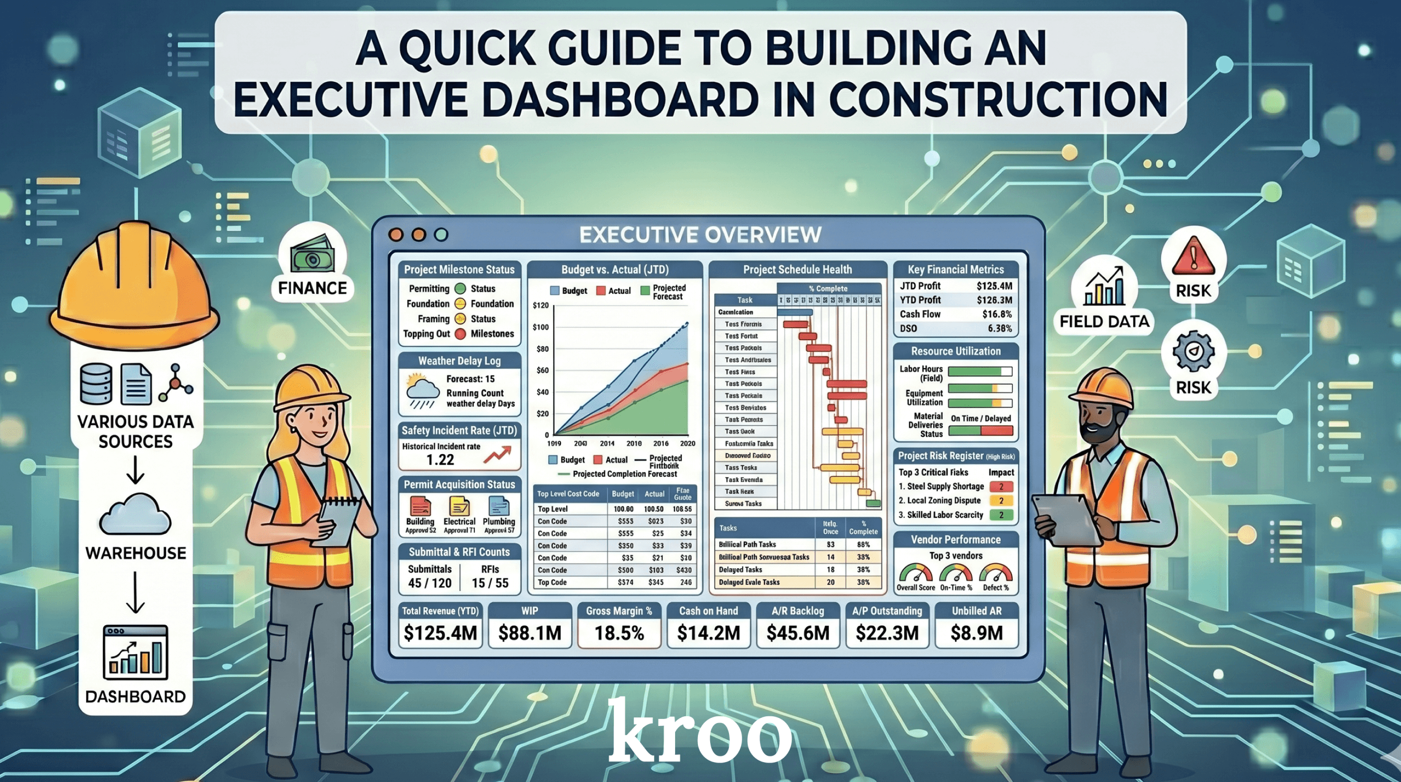
Most construction executives care about a short list of things. Their jobs are either running on budget or they are not. Their cash position is either healthy or it is not. The project is either on schedule or it is not. There are either operational problems brewing on specific projects or there are not.
That translates to a handful of metrics that belong on almost every executive dashboard.
Financial performance by project. Cost to date versus budget. Revised budget including change orders. How much has been billed, and how much is still outstanding. Projected fee versus actual fee trended over time. These numbers tell you at a glance which projects are performing well and which ones need attention. It'll flag the underbillings and overbillings, broken down by project type, by project, by cost division, by cost code, and more. The key is keeping things at a high-level with flags and leading indicators, but still offering the ability to toggle financial visualizations and drilling down into a more granular level.
Net cash position. This is important to track across the company, looking at JTD costs, JTD billed, open accounts receivable, and open accounts payable, filterable by job, project type, or geographic region. You want to see what you are owed and what you owe, and whether those numbers are trending in the right direction. You should also track your cash position historically to observe trends over time.
Leading indicators. These are the metrics that tell you something is heading in the wrong direction before it becomes a real problem. Cost percent complete compared to schedule percent complete. Burn rate on general conditions implying how many weeks left you can afford relative to what the schedule indicates. Change order volume relative to original contract. You are looking for jobs where the math does not add up, and then building quick leading indicator flags. The goal is to be agile with your data and make decisions more quickly to protect against margin erosion.
Project-level status. A simple view of all active jobs with a color indicator. Green means things are tracking. Yellow means something needs attention. Red means someone needs to make a call. Executives should be able to scan this in thirty seconds and know where to focus. Adopting a "red-yellow-green" approach to the executive dashboard as a whole is a best practice to keep in mind.
What does not belong on an executive dashboard
This is just as important as what does belong. You don't want to overcrowd your executive dashboard with distractions. The dashboard isn't meant to be a cryptic puzzle. It's meant to be a decision-making tool.
RFI counts and submittal counts are project -level metrics, not executive metrics. Your presidents and CFOs do not need to see the total number of open RFIs. They need to know if a specific project is falling behind because of design delays. Those are different things.
Pie charts showing how the budget is distributed across cost categories look impressive but rarely drive decisions. Most executives already know their budget breakdown. What they want to know is whether they are on track. And what the selected leading indicators say about specific projects.
Corporate financial metrics like EBITDA, DPO, or DSO belong in a separate financial-focused dashboard, not mixed in with project performance data. They serve a different audience and a different purpose.
When in doubt, leave it out. A simpler dashboard that gets used is worth ten detailed ones that sit untouched. Otherwise, just ask the executives if they would actually use it. Better to confirm upfront to guarantee usable product.
Which system to trust for what
One of the most common mistakes in construction dashboards is pulling financial data from the wrong system.
Your ERP is the source of truth for financial data. Budget. Cost to date. Accounts receivable. Accounts payable. Cash flow. All of that should come from your ERP only. If your project management software also tracks contract values or cost, you need to decide upfront which one wins. Mixing them will give you wrong numbers.
Your project management software is the source of truth for field data. RFI status. Submittal logs. Daily reports. Observations. Safety incidents. Schedule milestones in some cases. That data lives in the field system and should be pulled from there.
When you are building a dashboard, always ask for each metric: where is the actual source for this? Then pull it from that source and that source only. Executive dashboards are meant to be pulling from multiple sources, so it's extremely critical to reconcile your data to ensure the right information is being used.
Start at the company level, then drill down
The executive dashboard should start with the highest level view. All active projects across all companies, with the key financial and status metrics visible at once.
From there, an executive should be able to click on a company and see just that company's projects. Then click on a specific project and see the details.
This is the drill-down approach. The top level tells you where to look. The detail level tells you what is actually going on. You should not need to build a separate dashboard for every level. You build one dashboard with multiple levels, and the executives can decide how granular they need to go based on how they're looking at specific metrics or jobs.
Make the colors mean something
Color is one of the most powerful tools in a dashboard when used correctly. It is also one of the most misused.
Red should mean there is a problem that needs action. Green should mean things are on track. Yellow should mean something to watch but not yet a crisis.
Do not use color for decoration. Do not use different colors just to make different bars look different. When someone sees red on your executive dashboard, their pulse should quicken slightly because red means something needs their attention today.
If everything is green and things are actually fine, that is a good day. If something turns red, the dashboard has done its job.
Keep it simple. Don't overcomplicats with dozens of colors.
Terminology matters more than you think
This sounds minor but it is not. The words you use on a dashboard need to match the words your team uses every day.
If your ERP calls it the original budget, call it the original budget on the dashboard. If your team calls something the revised contract amount, call it that. The moment someone looks at a dashboard and sees a label they do not recognize, they stop trusting the numbers.
Walk your first draft past the people who will use it before you consider it done. Ask them: does this terminology match what you see in your source system? Are these the same numbers? If they point out that a number looks wrong, it probably is. Fix it before you roll it out.
The rollout matters as much as the build
Build the dashboard with one team first. Get their feedback. Fix the things that are wrong or confusing. Then expand.
This is not just about saving time. It is about building trust. A dashboard that goes out to twelve people at once and has two numbers wrong will be dismissed by most of them. A dashboard that goes out to one person, gets refined, and is clearly accurate will become something people check every morning.
A good executive dashboard does not replace meetings. It changes what meetings are about. Instead of spending the first half of every project review gathering the numbers, you walk in already knowing which projects have problems and spend your time talking about what to do about them. Again, the executive dashboard should be a dynamic, decision-making tool to make everyone's lives easier.
That is the goal. And it is achievable with the right data and the right design. We work with dozens of general contractors and specialty contractors, and we've seen what executives want from their data. What we have shared here is truly a practical guide that you can use for your team.
Ready to build an executive dashboard your team will actually use? Let's chat.
Request a Demo